
Check out the complete UX design process
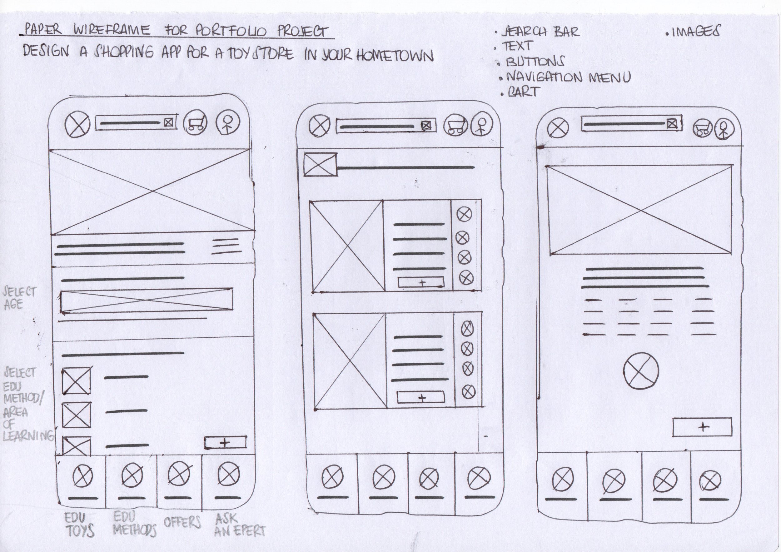
1. PAPER AND DIGITAL WIREFRAMES
Initial quick ideation.
To jumpstart the design process, I sketched out some initial concepts for the app.
This allowed me to quickly explore different possibilities and identify the most effective approaches.
Here's a glimpse at one of the early iterations.
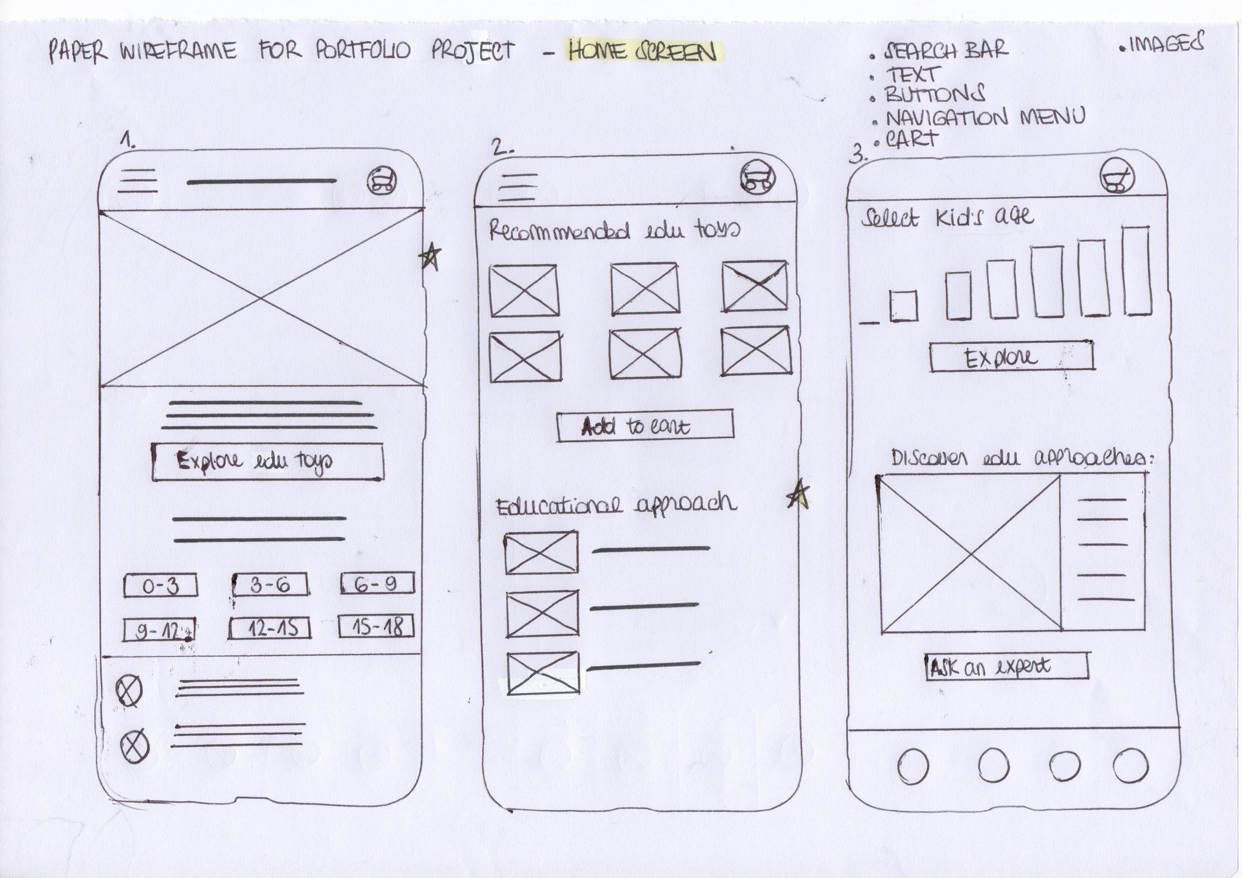
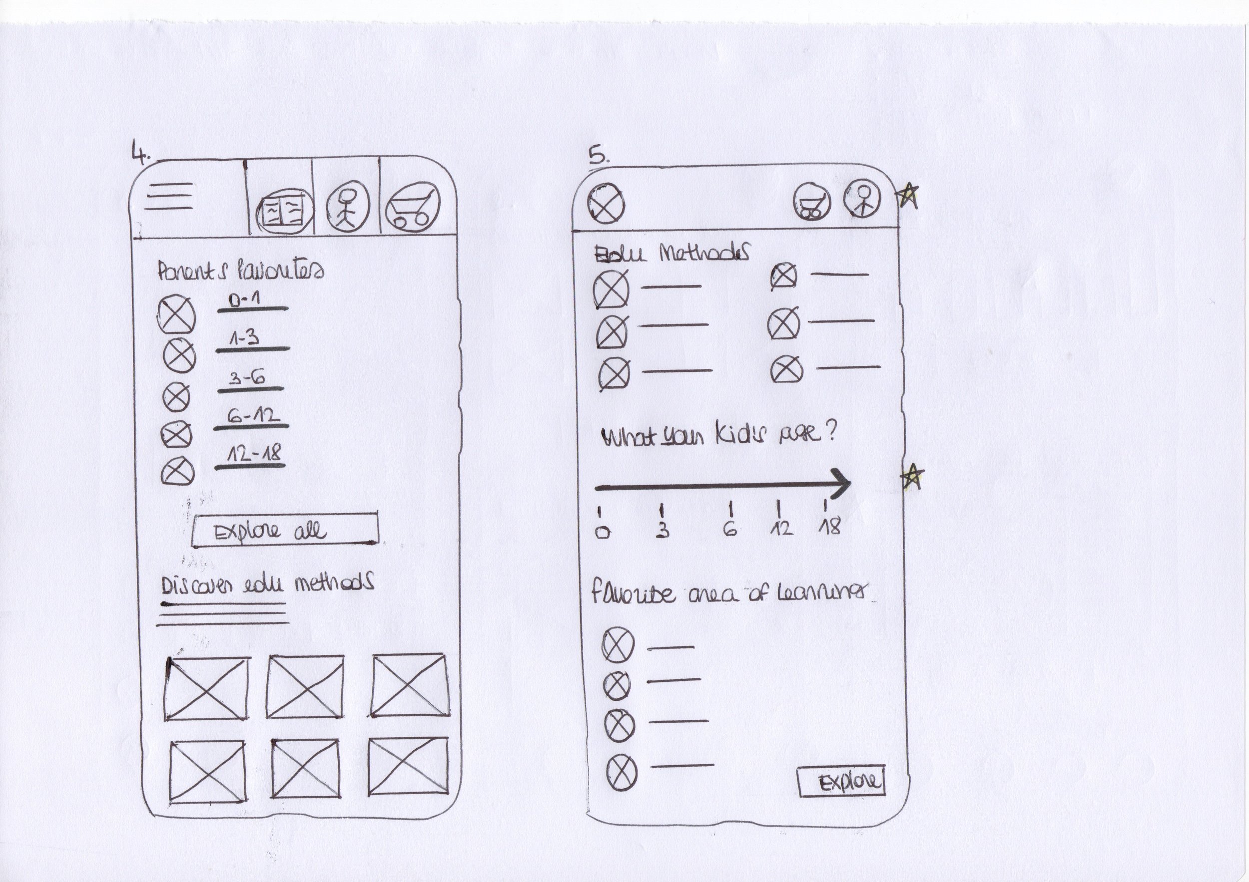
Taking ideas to the next level.
As the initial design phase continued, I made sure to base screen designs on feedback and findings from the user research.


-
![]()
“The access to navigation is easy, so I can save time”
User 1
-
![]()
“These two interactive sections allow me to easily select the exact guidelines for my ideal item search”
User 2
-
![]()
“This button let me discover the play guide with helpful ways to play, expert tips, and development information for at-home activities”
User 3


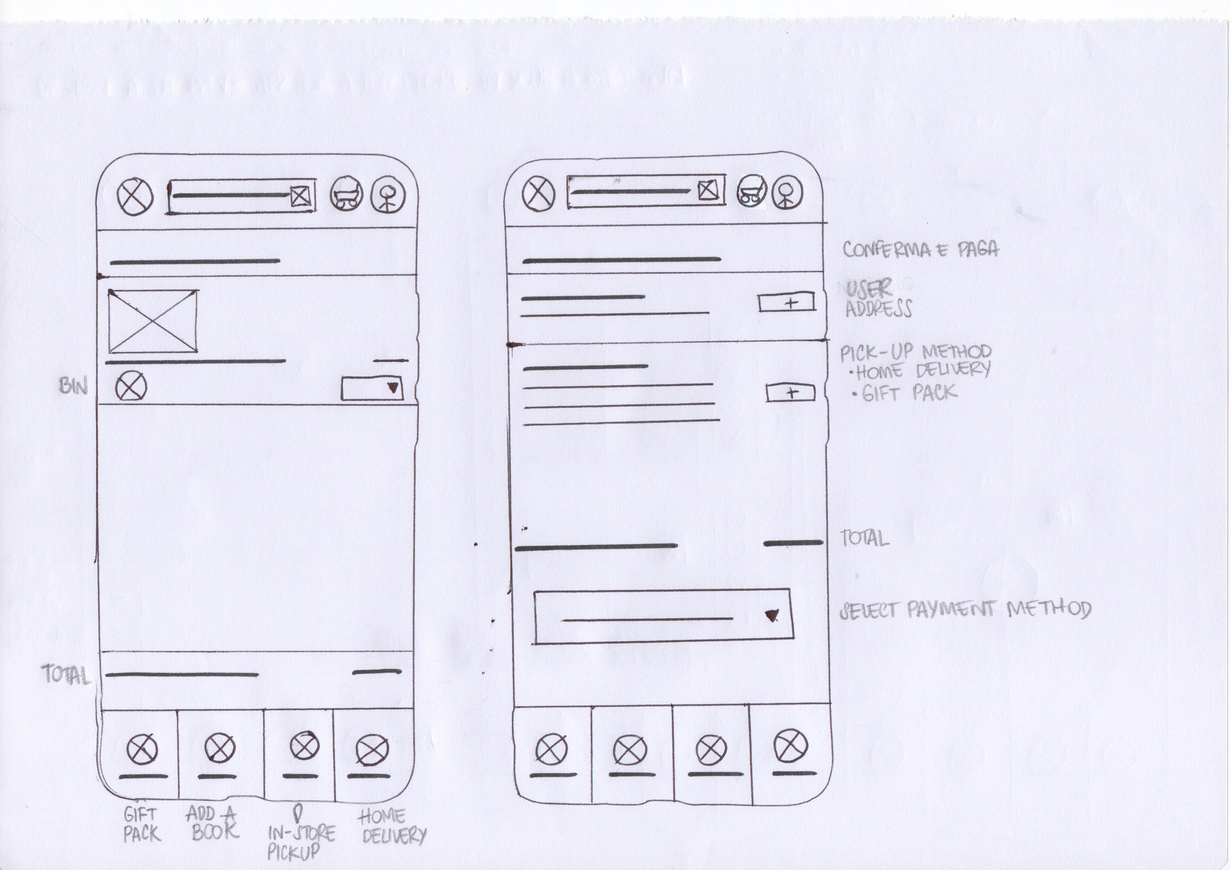
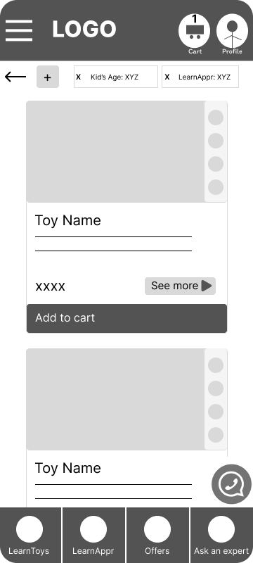
2. LOW FIDELITY PROTOTYPE
Let's See It in Action!
Here's a glimpse of the low-fidelity prototype outlining the essential steps users will take to:
find the perfect learning toy
select the one that meets their favorite learning approach
proceed with the purchase choosing pick-up in store or home delivery
Users can complete a task or user flow, move forward and backward, and navigate with the cues included.
Usability Study: Round 1 Findings
-
1. Users want a concise and informative fact sheet that highlights the key features of each learning approach
-
2. Users want to be able to add more items to their cart before proceeding to checkout.
-
3. Users want an explanatory label placed under each icon that clarifies the meaning of the icon itself
But how did users react?
During my very first usability tests with the lo-fi prototype, a common theme emerged: users consistently reported difficulty grasping the concept based on the low-fidelity design. While they understood the basic flow, the lack of visual elements seemed to hinder their understanding.
To address this challenge and ensure users could truly experience the intended interaction, I decided to iterate the prototype, prioritizing user flow, while introducing some basic visual elements for a more realistic experience.
I'll hold off on refining the user interface (UI) for now, focusing solely on making the core functionality clear and intuitive.


Usability Study: Round 2 Findings
-
1. User feedback indicated the navigation bar lacked clarity.
-
2. Based on user feedback, the cluttered navigation system was slowing the user experience down.

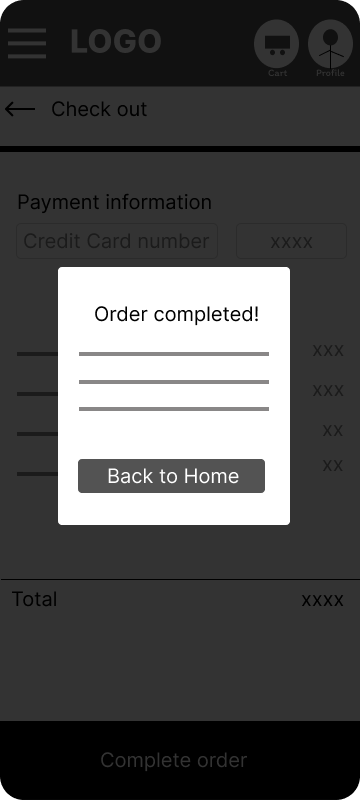
3. MOCKUPS & HIGH-FIDELITY PROTOTYPE
Let’s start to get a visual makeover

Before -> After

Before -> After
Let's check out the final outcome.

4. BRANDING AND VISUAL DESIGN
Back to the Future.
Back in 2018, I jumped right in the world of education by getting certified in the Montessori method for age 0-3.
This amazing experience opened my eyes to a whole new way of teaching and learning, and I couldn't stop there!
I continued exploring different educational approaches, eager to see what else was out there.
One thing I noticed on my journey was the uneven spread of Montessori principles in Italy.
While it still hasn’t widely used in schools, thankfully, things seem to be changing!
People are starting to recognize the amazing benefits it offers for children's development – both mentally and emotionally.
This growing awareness, and the desire to contribute to a positive change, is what really sparked my will to find a way to make Montessori principles, and other educational approaches, more accessible to everyone.
This is what I wanted to impart with every bit of this product: a simple, intuitive, fresh and modern design, delivering educational content in a straightforward and engaging manner.
-

COLORS
I created a color palette that evokes a sense of childhood wonder, using a limited range of colors and emphasizing white space for a clean and uncluttered look. The soft, rounded corners and limited color palette with variations contribute to a friendly and approachable visual experience.
-

TYPOGRAPHY & ICONOGRAPHY
I chose Poppins, a versatile and friendly sans-serif font, with a clean and modern appearance, while still maintaining good legibility even in small sizes.
The font’s slightly rounded edges and soft curves exude a sense of playfulness and approachability.
-

COPY
I used conversational language to create a sense of friendly interaction, familiarity, warmth and making the App feel less like a sterile tool and more like a friendly companion on the learning journey.
The conversational language wants to encourage user participation, inviting the user to actively engage with the App’s content, for a more interactive learning experience.
5. ACCESSIBILITY
One Love, One Heart.
