1. PAPER AND DIGITAL WIREFRAMES
Initial quick ideation.
To jumpstart the design process, I sketched out some initial concepts for the app.
This allowed me to quickly explore different possibilities and identify the most effective approaches.
Here's a glimpse at one of the early iterations.
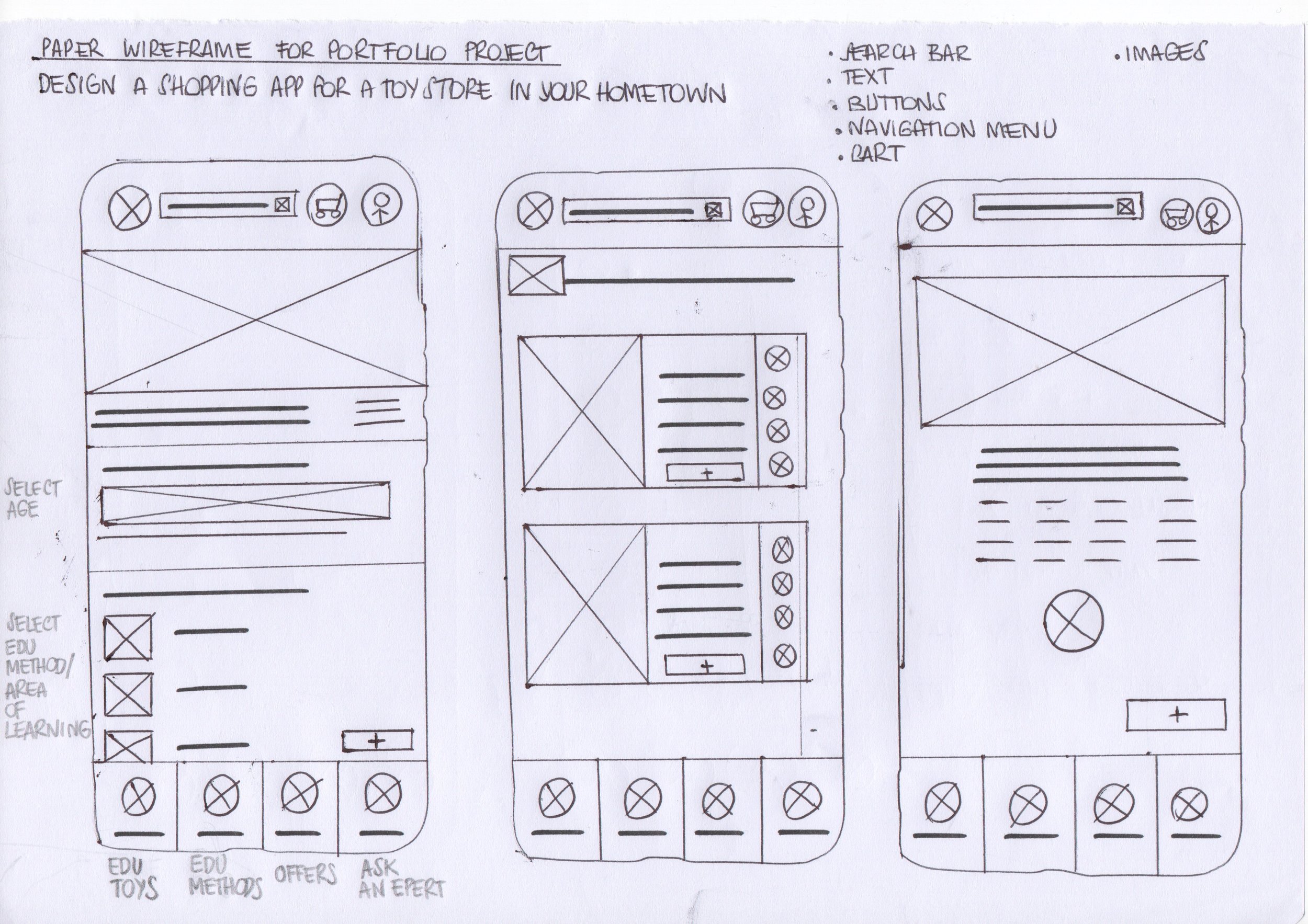
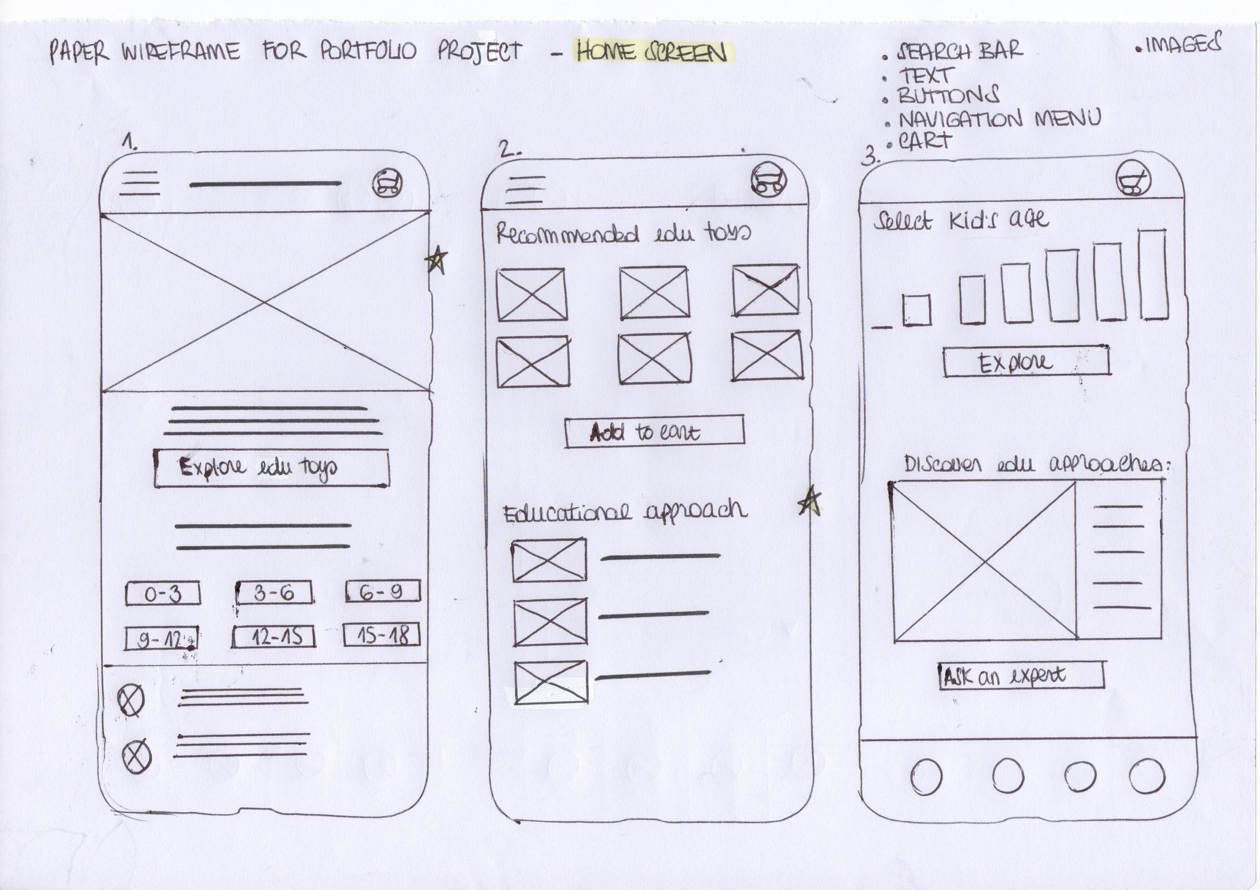
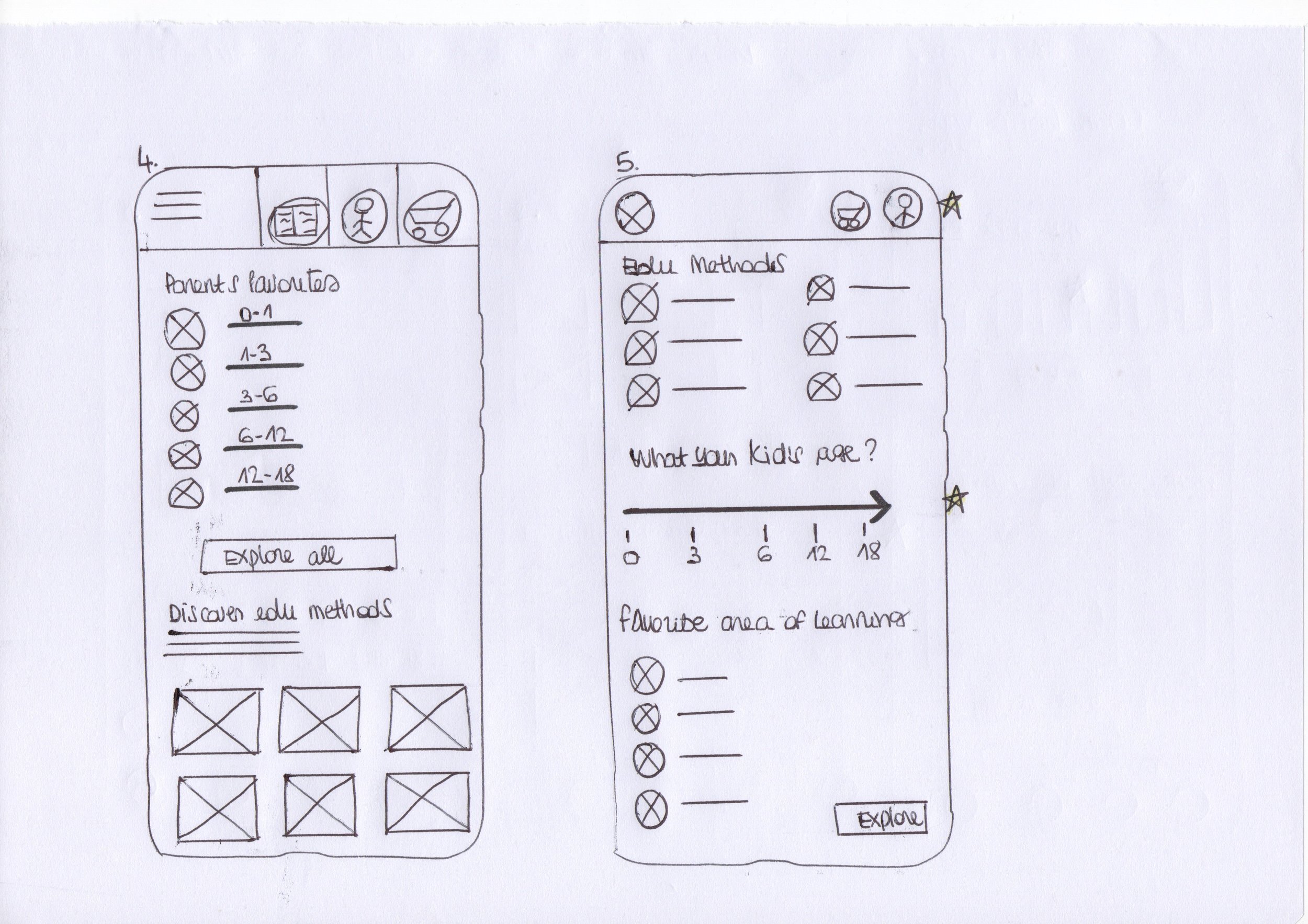
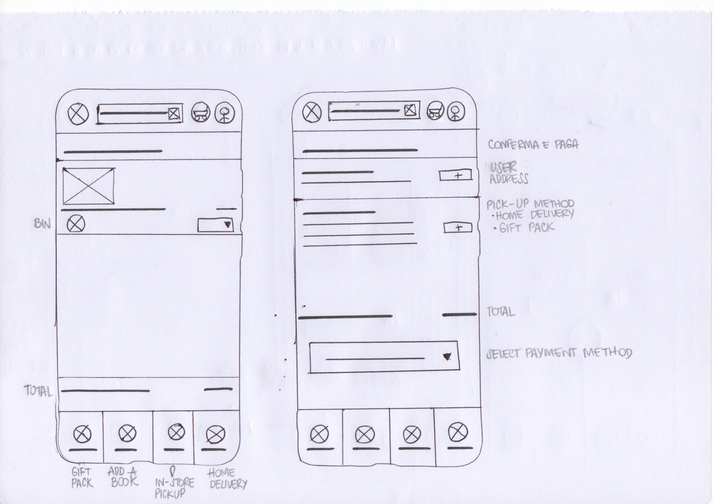
Taking ideas to the next level.
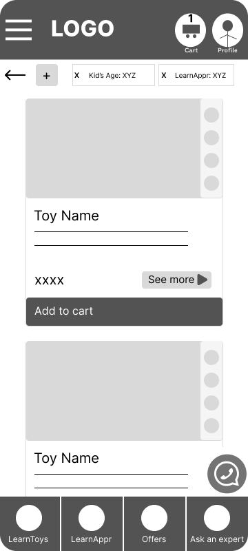
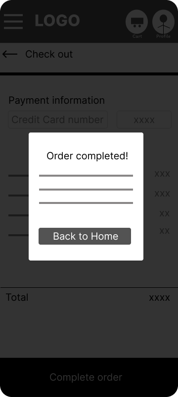
As the initial design phase continued, I made sure to base screen designs on feedback and findings from the user research.




-
User 1
“The access to navigation is easy, so I can save time”.
-
User 2
“These two interactive sections allow me to easily select the exact guidelines for my ideal item search”.
-
User 3
“This button let me discover the play guide with helpful ways to play, expert tips, and development information for at-home activities”.
2. LOW FIDELITY PROTOTYPE
Let's See It in Action!
Here's a glimpse of the low-fidelity prototype outlining the essential steps users will take to:
find the perfect learning toy
select the one that meets their favorite learning approach
proceed with the purchase choosing pick-up in store or home delivery
Users can complete a task or user flow, move forward and backward, and navigate with the cues included.
Usability Study: Round 1 Findings
-
1. Users want a concise and informative fact sheet that highlights the key features of each learning approach
-
2. Users want to be able to add more items to their cart before proceeding to checkout.
-
3. Users want an explanatory label placed under each icon that clarifies the meaning of the icon itself
But how did users react?
During my very first usability tests with the lo-fi prototype, a common theme emerged: users consistently reported difficulty grasping the concept based on the low-fidelity design. While they understood the basic flow, the lack of visual elements seemed to hinder their understanding.
To address this challenge and ensure users could truly experience the intended interaction, I decided to iterate the prototype, prioritizing user flow, while introducing some basic visual elements for a more realistic experience.
I'll hold off on refining the user interface (UI) for now, focusing solely on making the core functionality clear and intuitive.


Usability Study: Round 2 Findings
-
1. User feedback indicated the navigation bar lacked clarity.
-
2. Based on user feedback, the cluttered navigation system was slowing the user experience down.
New Nav Bar.
Based on feedback no. 1, I redesigned the navigation bar for a smoother user journey:
Sharper Focus: I streamlined categories and tucked "learning approaches" into a detailed tooltip, users can explore on the fly during the purchase process, keeping things clear and concise.
Crisp Contrast: A cleaner design makes navigating a breeze.
Intuitive Flow: “Profile” and “Cart” sections have been moved to the bottom for easy access.
New Tab Lines.
Based on feedback no. 2, I turned it into a streamlined more focused system with two clear tabs lines:
Learning Approach
Age
This focuses the user filtering power and lets them find the right fit, faster and easier.
3. MOCKUPS & HIGH-FIDELITY PROTOTYPE
Let’s start to get a visual makeover!

Before -> After

Before -> After
Let's check out the final outcome.


4. BRANDING AND VISUAL DESIGN
Back to the Future.
Back in 2018, I jumped right in the world of education by getting certified in the Montessori method for age 0-3.
This amazing experience opened my eyes to a whole new way of teaching and learning, and I couldn't stop there!
I continued exploring different educational approaches, eager to see what else was out there.
One thing I noticed on my journey was the uneven spread of Montessori principles in Italy.
While it still hasn’t widely used in schools, thankfully, things seem to be changing!
People are starting to recognize the amazing benefits it offers for children's development – both mentally and emotionally.
This growing awareness, and the desire to contribute to a positive change, is what really sparked my will to find a way to make Montessori principles, and other educational approaches, more accessible to everyone.
This is what I wanted to impart with every bit of this product: a simple, intuitive, fresh and modern design, delivering educational content in a straightforward and engaging manner.
Here’s how I did that.
5. ACCESSIBILITY
One Love, One Heart.
-
HIGH CONTRAST RATIOS
Following WCAG accessibility guidelines, I ensured high contrast ratios. Buttons boast a contrast ratio of 12.51:1, making them exceptionally easy to read for users with visual impairments. The text itself maintains a strong contrast ratio of 8.72:1, further enhancing readability and inclusivity.
-
ACTIVE TAB INDICATORS
The primary navigation tabs at the top of the frame use both color and an active tab indicator to differentiate between active and inactive tabs. This design element helps to capture the attention of visually impaired users, making navigation clearer and more inclusive.
-
PRIORITIZING COGNITIVE LIMITATIONS
This translates into clear and concise product categorization, simplifying navigation and discovery. Simple descriptions with actionable tips provide focused guidance without overwhelming users. High-resolution product images accurately represent options, empowering users to make informed decisions.


